Enhancing your website’s visual appeal with YouTube Channel
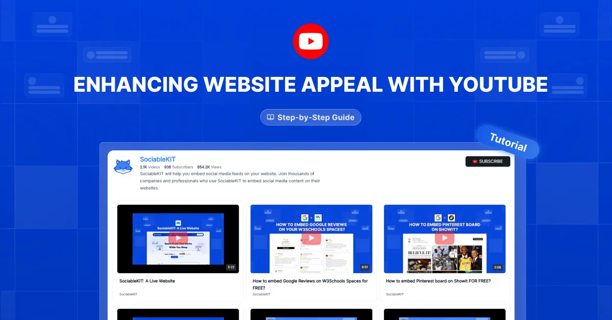

This article explores how videos from your YouTube channel can make your website more attractive and inviting. You’ll learn how to choose, arrange, and display videos so they fit your design and help your visitors.
A well placed video can show visitors what you offer in a way that words alone cannot. Keep reading to learn how to create a polished video section that is easy to explore.
Many website owners add videos wherever they find space and hope the page looks better. You may have done the same, only to end up with crowded sections, uneven thumbnails, or videos that look awkward on a phone. Start by reviewing one video section and making it clearer, neater, and easier to use.
A beautiful website gives every video a reason to be there.
Give Every Video a Purpose
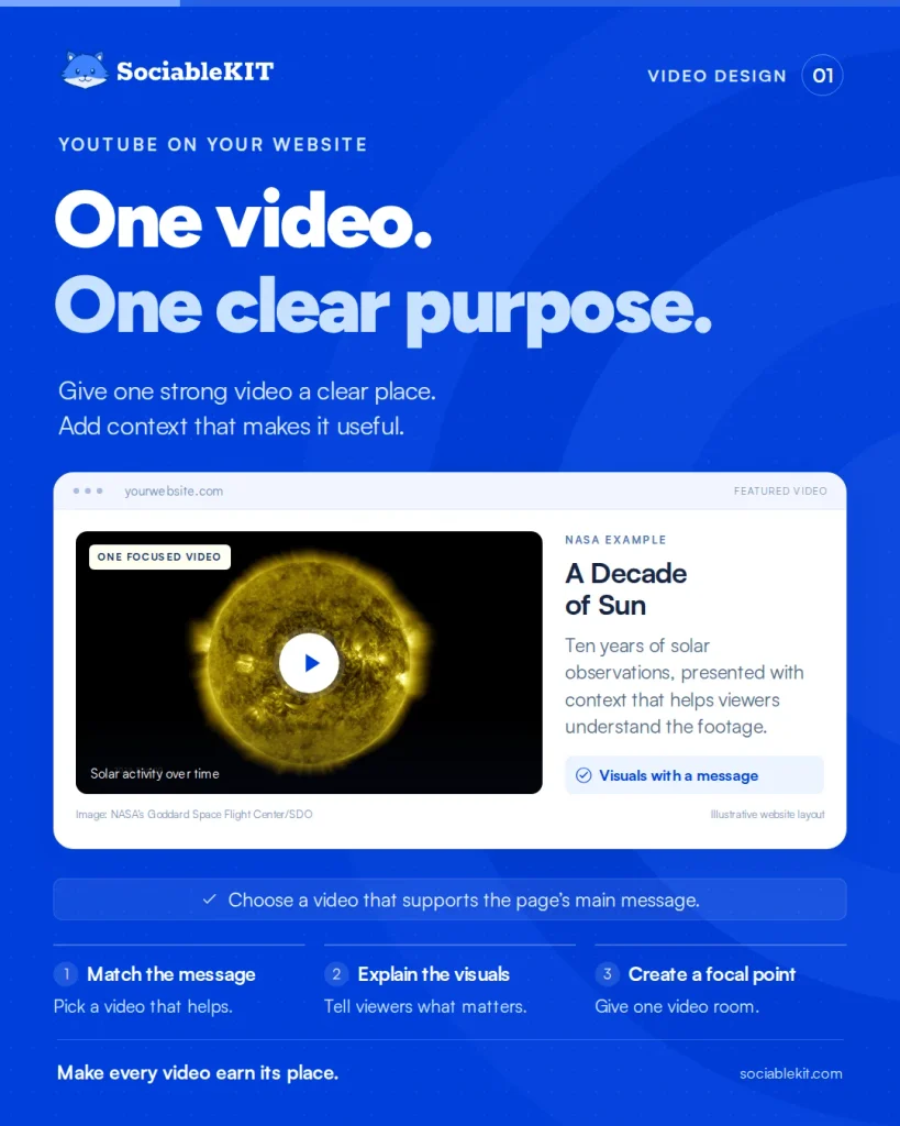
Choose videos that support the page’s main message, such as a product demo or a helpful guide. Feature one strong video where it adds value instead of filling every gap with content.
NASA’s A Decade of Sun brings ten years of solar observations into one video. Its website pairs the footage with an explanation of what viewers are seeing. The example shows how striking visuals can support a clear message.
Choose videos that help visitors understand the page, then give them a clear place in your design.
Make Thumbnails Feel Connected
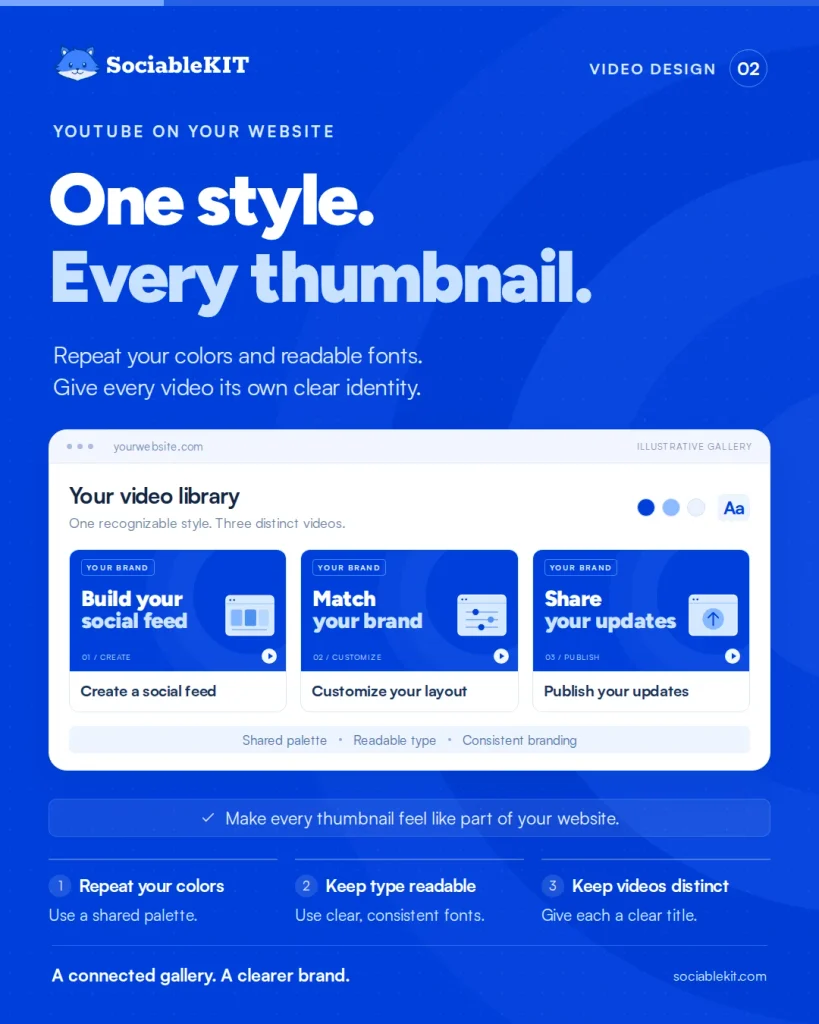
Use clear thumbnail images with a consistent style for your channel’s videos. Repeat your brand colors and readable fonts so the gallery feels connected to your website.
Vireo Video added Sounds True branding across the company’s YouTube thumbnails. The team also tested colors and wording to refine the designs. For a website gallery, the useful lesson is to create a recognizable style while keeping each video easy to identify.
Treat your thumbnails as part of your website’s design.
Turn a Pile into a Path

Group related videos under clear headings, such as Tutorials, Customer Stories, or Product Demos. Keep spacing even and show a manageable selection before offering more.
LevelUpLifePath brings its YouTube videos and other social content into one social page on its website. Visitors can explore videos, ideas, and updates without searching across separate accounts. This shows how a dedicated content page can make a brand’s videos easier to discover.
Give visitors a clear path through your videos instead of one long, mixed collection.
Give People a Reason to Play
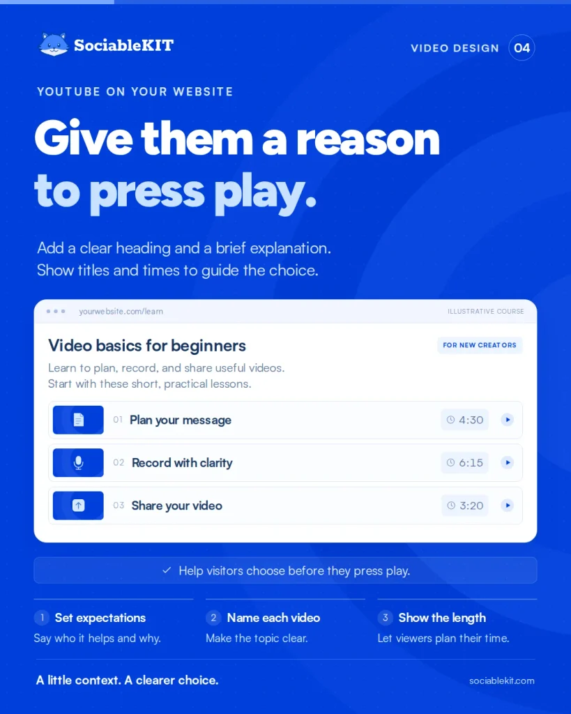
Add a clear heading and a brief explanation near your video section. Use readable text and enough empty space to keep the page comfortable to scan.
Ahrefs’ Video Marketing Course page explains who the course is for before listing its lessons. Each listed video has a title and a running time. This structure offers a useful example of helping visitors choose before they press play.
Use a little context to make your video section easier to understand.
Design for the Phone First
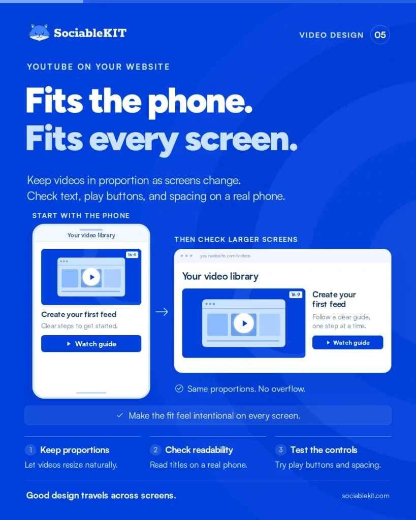
Make sure your videos resize to fit the screen without stretching or spilling beyond the page. Test thumbnail text, play buttons, and gallery spacing on a real phone.
Developer Scott Hanselman built a page featuring a YouTube trailer for his speaking video. He described making the embedded player resize while keeping its proportions. His example illustrates why a video’s fit matters as much as its placement.
Your video section should look carefully designed on every screen.
Build a Gallery You Can Maintain
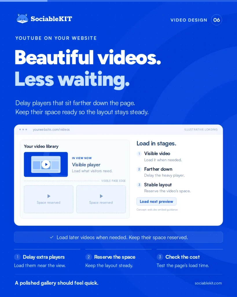
Use a website widget to bring your YouTube channel videos into a gallery you can customize. Choose a layout, colors, and fonts that fit your website, then check how the gallery looks on different screens.
Wanderingg Foodie shares food and travel stories through YouTube videos and Instagram Reels. Its website brings content from both platforms together, letting visitors watch without leaving the site. The case study describes a more visual website that stays fresh with less manual work.
Use the YouTube Channel widget from SociableKIT to create a video gallery that matches your website.
Thanks for reading!
Thank you for reading our article on making your website more appealing with YouTube channel videos. We covered purposeful video choices, consistent thumbnails, clear layouts, mobile viewing, loading speed, accessibility, and a widget to bring it together. Follow us and subscribe to our newsletter for more practical ways to improve your website.